This weekend I spent several evenings applying mulberry and banana paper layers to the surface of some pieces. My family was out of town, so I watched about 25 episodes of The West Wing as a background to tediously ripping, glueing and sticking paper pieces on the sculptures. (Watching the show in 2014 was a little jarring. Maybe I'm just more sensitive to misogyny than I was back then--but also how can they refer to the Redskins 80 zillion times without commenting on the damn name?).

Anyway, while I listened to the show, I put paper on about 11 pieces and finished one that I had been working on last year. The paper layer provides a contrasting surface texture and, in some cases, a contrasting color. The piece below was matte green on the outside. I think the red textured paper improves the piece. (I suppose the image is better, too.)


In some instances, the original color didn't look right or was streaky. I fired the orange and blue/green piece below about 3 times, adding layers of orange to the surface to cover up some blue streaks. Even though I reapplied the color and reglazed, the blue still showed through. This piece was started years ago, so on recent pieces I have been more careful about cleaning up my mistakes before firing. I applied the orange, yellow and tan layers of mulberry paper on the pod shapes. I might eventually add mulberry paper to the other orange sections as well. I haven't decided.

Some of the paper has fiber inclusions. Based on some research from yesterday, I think the paper is either banana or mango paper. A layer of Mod Podge (adhesive) over the top highlights the contrast between colored paper and the fibers, darkening each and sometimes emphasizing the glaze color that shows through the thin sections of paper.

The green and red pieces (above and below) are actually a wall-mounted set of forms that were supposed to be part of an installation. I dropped one and broke it in half. The paper layer obfuscates the crack and repair--bet you can't tell which one was damaged (I can't).

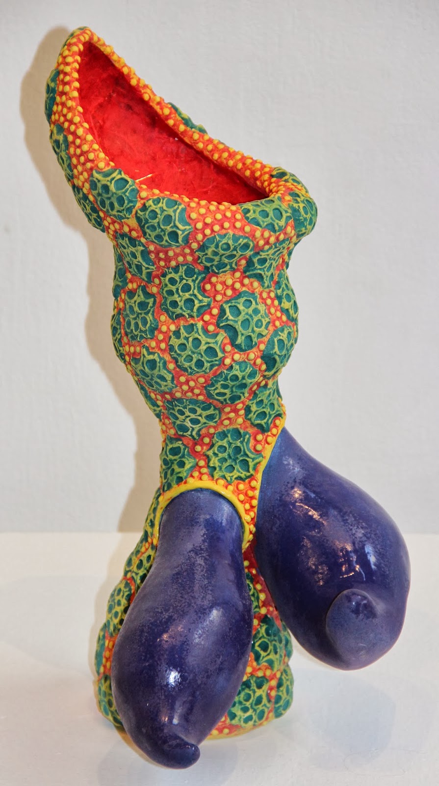
One other piece had some damage to hide. The spiky blue parts (below left) had some minor cracks near the bottom. I patched them with epoxy and wood putty and was considering covering them with paper. I layered the inner spaces with red banana/mango paper and red and yellow mulberry paper, but didn't start on the blue. I didn't have blue banana paper--also I ran out of time. I could have tried some mulberry paper, but the mulberry paper is perhaps too plain or boring to cover large areas.


I may end up painting over the patched cracks on the spiky piece above so that the glazed and unglazed blue spikes can contrast against the paper textures inside. Last year I applied orange mulberry paper onto a large surface of another piece (above right) but besides being surprisingly soft, the surface is not particularly interesting.


I have collected my papers from a variety of sources over the years. Most of it I no longer remember buying. My parents gifted me a few rolls of red and green papers two years ago for Christmas. I used the red on the piece below, as well as a piece last year. Inside, as a contrast, I used orange paper so that the holes, which open up to the interior of the form, show a different color.

Unfortunately, I ran out of the orange paper. Nowhere in Yakima seems to sell handmade paper. Michael's, The Bindery, and Craft Warehouse all sell patterned card stock and other papers for scrapbooking (and stationary and drawing paper), but nothing thin, flexible and with a varied texture. I ended up searching online and I've ordered some paper to finish the interior of the box above and to use for future projects.


All the papers look different depending on whether the Mod Podge is applied just to stick the paper to the ceramic or as a layer covering the surface as well. I like both textures for different applications.

Sometimes I use the paper layer on the entire surface, sometimes for a contrast to the glazed surface. Occasionally, as in the piece above, I will apply just a tiny bit of paper to a piece. Here the red paper and Mod Podge is concentrated inside the "eyes." The rest of the surface of this piece is textured and layered with underglazes. The paper color provides a good contrast, though I've had a hard time taking a good image of this piece. (I think I tried about 6 times on two different occasions yesterday.)

One thing I haven't tried much is including a Mod Podge covered shiny surface as a contrast to the soft paper surface on the same piece. These little guys used to have red tips but they apparently bothered people, so I tried making them blue. What do you think, Josie?
No comments:
Post a Comment
Tell me what you think about my work or this post