Tuesday, July 31, 2018

Rude Bulbs

The coat Melania Trump wore to meet immigrants who had been detained and separated from their children said "I really don't care do u?"

This summer I ended up making more rude bulbs than I initially intended to for this summer's political bulbs project now up at Columbia Center for the Arts in Hood River, Oregon. Some of these are rude because the news was rude. Some are rude because I just felt like being rude.

What fills a MAGA (Make America Great Again) hat? Ice cream or poo?

I was happy to discover that even what I considered to be the rudest, most childish bulb that I have ever made, flew just over the heads of the young people who were visiting my studio. I was relieved when one young guest identified what I meant to be the poo emoji ðŸ’© in the hat as soft serve ice cream.

Grab them by the feline

Another of my rude pieces is similarly subtle. I sculpted what I wanted to be a tiny hand (hence the large sleeve) holding a pussy cat. I thought this was a clear reference to 45’s infamous “grab them by the pussy,” but I have since learned that this needs to be explained. I hope that in the context of 29 other bulbs addressing politics and the current administration, the reference will be more clear.

Scream 1 and Scream 2

The first screaming face was initially done as a direct representation of an angry white woman in a MAGA hat screaming at a protestor. I both enjoyed doing the faces and thought they so captured the current political discourse so well that I decided to make more.

nasty language bulb

I had been thinking of word as snakes, flames, and things that take on a life of their own once out in the world. I hadn't specifically thought to do this as a bulb, but I had been thinking of something similar for some time. The mouth with rude, hateful word flames coming out of it, for that reason, is one of my favorites of this series. I didn't include eyes because I didn't want them to distract from the topic and because the bulb shape makes their placement a bit awkward with the mouth and nose in this position.


Mansplaining bulb

I apparently forgot to take a picture of one of my last two rude bulbs from this series. I've discussed the "Well, actually..." bulb before, but in a similar vein I wrote on another bulb. This one, without a photo, says "Hey baby, can you give me a smile?" I was looking for the a generic phrase that captured the misogyny, patronizing tone, and entitlement that we all know in street harassment. It makes me cranky just writing and discussing it. I realized after I delivered the work that I should have covered the bulb in something utterly disgusting, like vaseline, so that the bulb, like the street harassment comments themselves, leaves a lingering film of unpleasantness for those who get too close.


Friday, July 27, 2018

Art-A-Day at Columbia Center for the Arts

Daily Conversations, Art a Day opens at Columbia Center for the Arts in Hood River, Oregon on July 31 and continues in the gallery through August 31. Come see my work during the opening reception on August 3 or during the regular gallery hours, daily, 11-5.

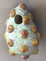
my favorite abstract bulb, a yellow and purple porcupine abstract bulb

In preparation for this exhibition, artists were asked to make a new artwork every day for 30 days and also write about their process.

Patterns, based on the ceiling at the Yakima Yoga Collective

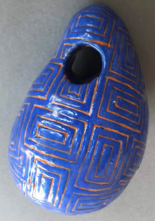
I made two sets of 30 bulbs each. One set is "abstract" bulbs. They are, in fact, mostly abstract, though towards the end of the building process I started making faces and hands which aren't so much abstract as random.

The second amendment

The abstract or random bulbs are in contrast to the other set of bulbs which are a continuation of a series I began last year and which I have alternately called political, protest, or patriot bulbs. Each one addresses something controversial in our nation, usually something prompted by the current administration's policies or rhetoric, or by major news stories in this country.

If you live in WA, your primary ballot is due August 7!

Taken together the political bulbs illustrate my own political views, but hopefully also leave room for interpretation and thoughfulness on some of the issues where ambiguity is possible or even natural. 

Hard to tell in the photo, but there are three colors in the bulb

The "abstract" bulbs, taken together, probably suggest that I was having fun with texture and color. In this post I've collected some of my favorites from both sets of bulbs.

Knit bulb (with ceramic bulb inside)

I enjoyed the abstract ones most when I tried something new, be it a new material incorporated into the bulb itself or a new sculpting or decorating technique.

front and back of the same abstract bulb from early on in the project

At one point I had intended to create contrasting textures on the front and back of each bulb in the abstract series, but some of my surfaces are too deep or complex to allow the bulbs to be easily hung in either direction.

second screaming bulb (abstract set)

As I mentioned, pure abstraction went out the window at some point in the process, and I prioritized having fun making the work over sticking closely to my original intent. Part of me wants to make faces and hands and maybe feet and other body parts for a whole series, but I'm not quite sure why.

just a random blue hand

Some of the bulbs also began to extend well past the boundaries of the bulb itself. The flower piece was fun to make and I'm pretty happy with the finished product, but difficult to photograph before it was installed.

flower bulb

I am unable to install this work during the assigned time, so I have delivered it to the gallery and they have installed it for me. I won't actually be able to get to the show to see the work until after the opening. If you are in the Hood River area, be sure to check it out (and tell me about it). The reception is July 2 from 6-8pm.

the bulb of nearly 1000 toothpicks


Wednesday, July 25, 2018

Art a Day Installation Grid and Mixed Media Bulbs

Mixed Media Bulbs

"Abstract" bulb with flower decoration, finished with underglaze colors, clear  gloss medium, and mixed media attachments.

I will be delivering both of my "abstract" and "politics" bulb sets of bulbs to Columbia Center for the Arts in Hood River tomorrow for their Art a Day exhibition opening in August. I finished up the glazing for these pieces last weekend and this week I have been finishing up the non-ceramic attachments for some of the pieces. 

Bulb in the process of having bike parts attached with epoxy

Out of 60 total pieces, about 20 have some element added on afterwards. In most cases the mixed media attachments are epoxied on after firing, in some cases the additions are tied or wrapped, as in the knitted cover that I made for one of the "abstract" bulbs. 

knit bulb

I had three pieces that came out of the last firing with incomplete glaze coverage. Since the pieces are not meant to be used for food or drink, I decided to coat them with a clear gloss medium--basically acrylic paint with no color. 

"abstract" bulbs with glitter paint

When I reached into my stash of paint bottles, I found a glitter paint that I must have inherited, but never used. I decided to give two of the "abstract" bulbs a contrasting texture of glitter gloss medium. It feels fairly silly to use glitter paint, but also an interesting texture.

Installation Grid


initial plans for installation spacing

I will not be able to install the work myself, so I also spent some time this week making a new paper grid to be used by the gallery staff who will be installing for me. I already have a paper grid for an installation of 100 bulbs, but this time around I am installing two separate grids of 30 each in the same 8' wall space. Additionally, my existing paper grid is confusing, with extra marks, mistakes, and triangles that need to be fitted together when putting the three separate pages on the wall. The existing grid only needs to be read by me, but the new one needs to be clear to other installers.

most of the "abstract" bulbs in place, with one "political" bulb to the right

Yesterday, with the temperatures in the 90s and above, I wanted to finish the grid in the morning. I laid out an 8' roll of paper on the back patio, arranged the bulbs on the paper to get a sense of the size and placement, and got out several tape measures and L-square rulers to measure and draw out my grid straight and even. My goal was to make the paper as clean and clear as possible so that the gallery staff only need to level the paper, tape it to the wall, and mark the holes. I was able to keep the paper mostly clear of extraneous pencil and ink marks, but I wasn't able to keep the cats from walking across the paper with dusty paws.

"abstract" hand bulb (I strayed away from the original idea of abstraction in these bulbs, but "no specific political message or story" bulbs sounds awkward).

The two sets of bulbs will each be arranged in grids of 5 bulbs wide by 6 bulbs high. As my paper wasn't quite large enough, I had to add paper sections to the bottom of the roll to make a large enough space. I marked the grid in pencil and marked the holes in marker with each hole mark circled for clarity. In the past when I have used the paper grid to install, I just drilled the holes directly through the paper. The gallery staff can do the same or they can mark each spot through the paper, then take the paper down to put up the hooks.

I hope the kitten wiped her paws before walking on my photo backdrop

While I was making the grid, I also took some decent photographs of the 57 bulbs that were finished at that point (two are still being epoxied together right now). I used my old photo backdrop on the ground and my phone camera rather than setting up my table, vinyl backdrop and tripod, but the results are fine and the best I care to achieve on my timeline. Theses photos at least do not have epoxy and other detritus in the background.

I think there are nearly 100 toothpick pieces epoxied into this bulbs. What was I thinking?

Today I will finish up the packing and the epoxy on the last two pieces, then I will deliver the work tomorrow. I also need to write about my process. I have blog posts and notes that I've written throughout the process, but nothing ready to present in a gallery, yet. I'm hoping that motivation to write will show up soon, otherwise I'll just have to set a timer, tie myself to my desk chair and force myself to begin. 

Trayvon Martin bulb; Martin had purchased skittles and Arizona before he was chased and killed. 

Thursday, July 19, 2018

Underglazing for Art a Day Project

a coat of wet terra-cotta under-glaze on the screaming face, before wiping

I finished the building for my Art a Day projects early last week and have been glazing since then. Right now I have 50 pieces in the cooling kiln and the rest are being glazed today. 

abstract and politics bulbs used different clays

I made the two sets of 30 from two different kinds of clay. The abstract bulbs are made with a reclaimed stoneware from last summer and the others are made with a red mica clay that I thought was similar to the clay I used for last year's political bulbs.

the new mica clay and the old political bulb clay

As it turns out, the new clay is much lighter in color and more sparkly than the clay I had last year. They look the same in the bag, but last year's clay was a gift and I didn't replace it with the same type. My intent was to keep the tone of these political bulbs much darker than the bright layered colors of the abstract bulbs. Last year I did this, but I also had some issues with last year's clay looking splotchy. It may have been because I wasn't as careful as I should have been about getting light clay on the dark clay because I was working the same space or with the same tools. 

the new red mica clay with under-glaze inlay at cone 04

I also wanted to use a clay that is pretty itself because, unlike most of my work, I didn't plan to cover it all with underglaze color. The mica in this particular clay causes little sparkles to be seen on the fired clay surface. I wanted to use the colored underglazes and shiny glaze solely to highlight the textures, lines, and impressed letters of the finished pieces and let the dark, sparkly clay also be visible.

the new red mica clay at cone 08 (left) and cone 04 (right)

I initially bisque fired all the pieces to about cone 08. I was impatient and wanted to go to bed with the kiln off, so I shut off the kiln a bit earlier than scheduled. I was disappointed in the very light orange color of the mica clay at this low temperature. In the second firing I had a mixture of greenware to be bisque fired, some underglazed abstract pieces and a couple of glaze tests, so I fired to cone 04. The mica clay looks much nicer at this temperature.

bulbs and sprigs waiting to come out of the bisque kiln

I was given a bottle of clear glaze in a brand I don't normally use, so I wanted to test it on the new mica clay before applying it to the finished pieces. Immediately after bisque firing (at either temperature), the political pieces are clearly distinct from the abstract pieces. I tried to apply color and glaze differently, too. However, during building, some of the content started to bleed across the edges of the two groups as I worked. I ended up with faces, eyes, and hands done in both white and red clays and some of the pieces I made with white clay could probably fit in with the political group.

each bulb needs three coats of underglaze, so some are drying while others away their first coat  

All of the abstract bulbs required two layers of underglaze. I used mostly highly textured surfaces and I enjoy layering the underglazes one over the other. In most cases, I applied one color to the background texture, a contrasting color to the sprigged additions, and sometimes another color to highlight a dot or contrasting part of the sprig. 

two sets of bulbs with one or two underglaze layers waiting to be glazed

After this first layer(s) of underglaze, I fired all of the abstract pieces again. After the work came out of this second firing, I applied a second coat to most of the abstract pieces, then wiped it away incompletely. The fired first coat stays put when I wipe away the second color from the raised surfaces. This approach highlights the textures, because one color is visible in the deeper recesses of the texture or sprig and another color is visible everywhere else. Most of the abstract bulbs have 2-4 different colors of under-glaze, some have 5 or 6.

political bulbs and one "abstract" face with under-glaze waiting to be wiped

Because of when I finished building, I had some newly dry work to bisque fire as well as some abstract bulbs with one layer of under-glaze. I also fired some of the political bulbs with a wiped coat of under-glaze inlaid into the textures to see the mica clay color at that slightly higher temperature at to determine whether I needed glaze in addition to underglaze in the impressed texture areas.

a political bulb on top of some abstract bulbs, all have had the underglaze layer applied and wiped and are waiting for glaze
After I applied underglaze, re-fired, reapplied underglaze, and wiped the surfaces, in most cases I also applied a clear glaze to the surface. In the political pieces I will probably use a combination of fired underglaze with glaze and without. The underglazes I use are mostly Amaco Velvets which have a nice of a texture on their own, and at least one of my colors fluxes by itself at cone 04. 

under-glazed and wiped politics bulbs waiting for glaze

In a few cases, I added under-glaze color and/or clear glaze over whole sections of the political pieces to try to accentuate the subject and make it more recognizable. In one case I felt the MAGA hat just needed to be red, in the other case I felt the ice (ICE) needed to be glossy in contrast the the bulb out of which it projects. I used a satin clear glaze one the ice and the underglaze alone on the hat. The kiln is over 1000 degrees Fahrenheit now, so I won't be able to see my results until tonight or tomorrow.

clear satin glaze covers the ice cubes in "Melt ICE"

Saturday, July 14, 2018

New Gallery in Yakima

Last weekend I was riding my bike home from the Folklife Festival and saw a sign advertising a new gallery in Yakima. The gallery, Artebella, had just opened that week. We stopped in to chat with the owner, Pamela Searcy, who invited me to show some work in the gallery.

small sculpture now at Artebella

I brought some work over this past week and she now has it on display. The gallery is open Fridays and Saturdays from 10-4 and is located at 1111 West Spruce St #33, in the medical office building area south of Yakima Regional/Astria Hospital.


small sculpture now at Artebella

The gallery is quite small, but the owner seems to be competent and conscious of what she's doing and why. Unusually for a small gallery, she had a contract ready for me and even emailed to set up a time for me to bring my work by. As of right now she has some small sculpture of mine, functional pottery by Mike Hiler, and paintings and bronze sculpture of her own. She also is working in the space. 

small sculpture now at Artebella

So, you should stop by when you get a chance. How about next weekend?

map of Artebella location


Tuesday, July 10, 2018

Text & Symbols on Bulbs


second amendment

I've been using text on my bulbs since last year. This year I wanted to use text again, but I wanted to address how difficult it is to read a whole surface of text, especially since the surface that I wanted to cover with text curves. Last year I had used the first amendment and the declaration of independence on the surface of different bulbs, but I found that during the year, when I showed these bulbs, I couldn't quickly identify the source of the text. The text looked just like a pattern.

first amendment list

This year I was thinking of the first and second amendment in contrast to one another. I was thinking about how factions in the political world of today latch on to one or the other of these amendments as their favorite or their rallying cry. I decided to add a rifle over the text of the second amendment to provide a visual clue to the content of the text, and I broke up the themes of the first amendment into bullet points instead of writing out the whole text. I also considered highlighting these terms in the whole text with contrasting color to help viewers quickly see the topic.

protest signs

I've used some hand written text as well. The signs I did earlier this summer are lettered by hand instead of using stamps. I wanted the text to look like marker on a poster board sign, rather than the fancy serif font of my text stamps.

"please vote"

I am trying to complete 30 (ahem, or 60 or 90) pieces for this Art a Day project and using text, and especially text stamps, helps speed up the building process for those pieces that use text. I had been trying to think of how to think of how to capture the amorphous and by nature slightly invisible issue of women being left out of the room in the current administration. We keep seeing rooms full of old white men with nary a woman or a person of color in sight. The small size of the bulbs doesn't really leave room for detailed drawings where one can discern gender, so I decided to go with symbols of gender.


"gender inequity"

To do this, I decided to cover the surface with identical circles, but mark very few as women and most as men. I used stamp for the circles, but chose a fairly large one. I then used a carving tools to draw in the arrows and lines for the male and female symbols. My first attempt ended up with very crowded looking symbols. I obscured these and used a thin line coming off the larger circle for my second attempt. I am still considering replacing this one with a version that uses a narrower and smaller circle stamp.
The white marks are corn starch that was used to keep the stamp from sticking.

I also tried to create a contrast of the two sides. On one side, all men with one woman barely visible, on the other side, a nearly equal split of the genders. However, the shape of the bulb makes this difficult because the symbols on the bottom and sides can be seen from both side of the bulb and the curving surface means that down on one side might be up on the other. 

"mansplaining"

In a second attempt to visually capture the issue of silencing women's voices in our culture, I wanted to use text to stand in for mansplaining, though I'm not sure how familiar a general audience is with the "well, actually..." phrase. 


"hate speech"

And, the final sculpture this week that incorporates text is this one that also incorporates an open mouth, a motif I've been playing around with lately. I have been thinking about this image for months, but I lost the sketchbook in which I initially drew this. I had to think of it again before I made it. The items coming out of the mouth are meant to be reminiscent of flames, snakes, or vomit. The words, of course, are a tiny selection of the many, many nasty names and allegations that have come out of our president's mouth in the last year or two.


ready to fire