 |
| Brooke and Victor's large bowl |
My friend Brooke got married in Spain this past summer. I had been hoping that we could join them, but COVID and uncertainties about traveling made me hesitant to plan international travel this summer. Instead of booking a trip to see her and her wedding, I threw some pieces for her and her new husband, Victor.
 |
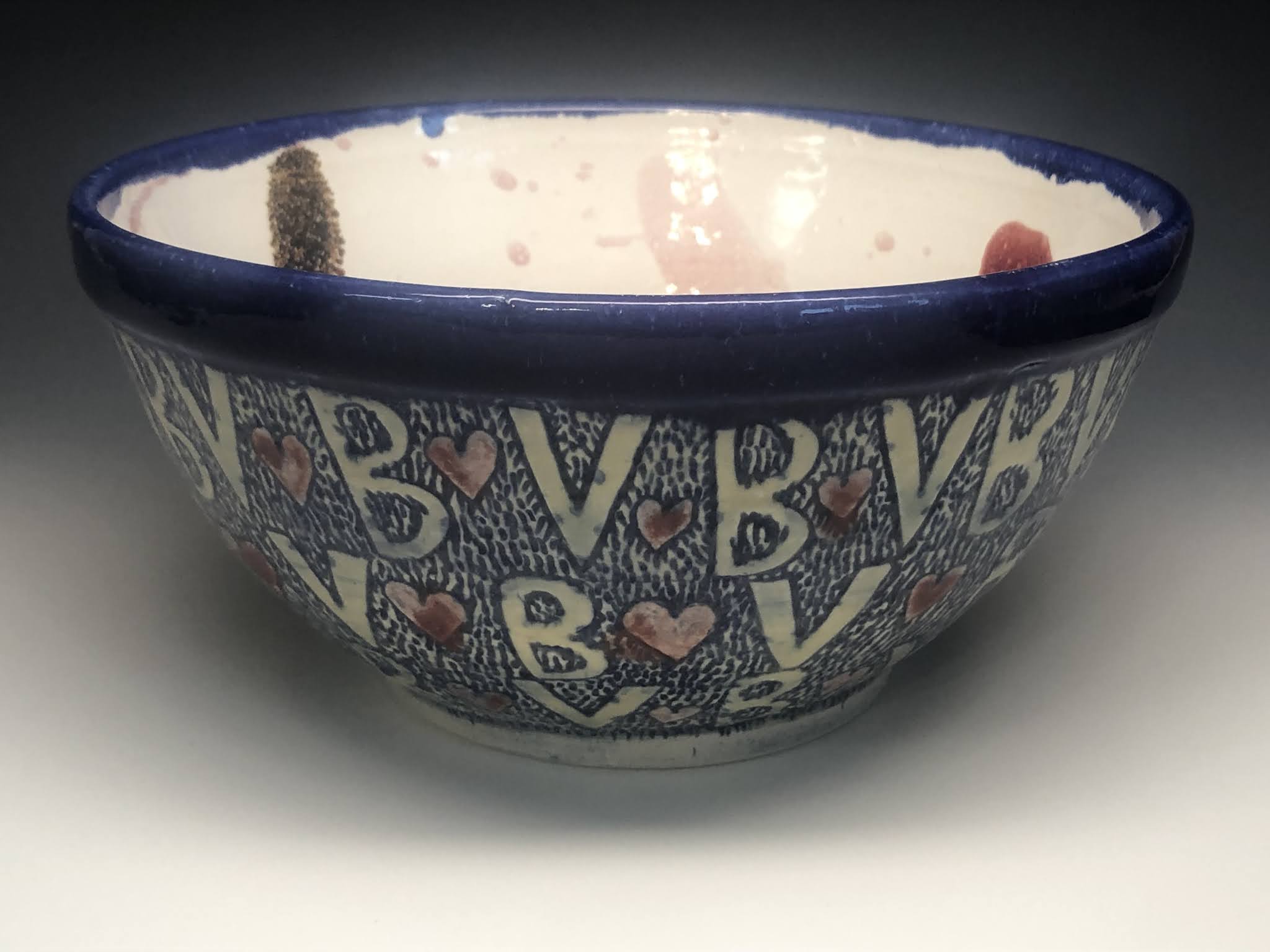
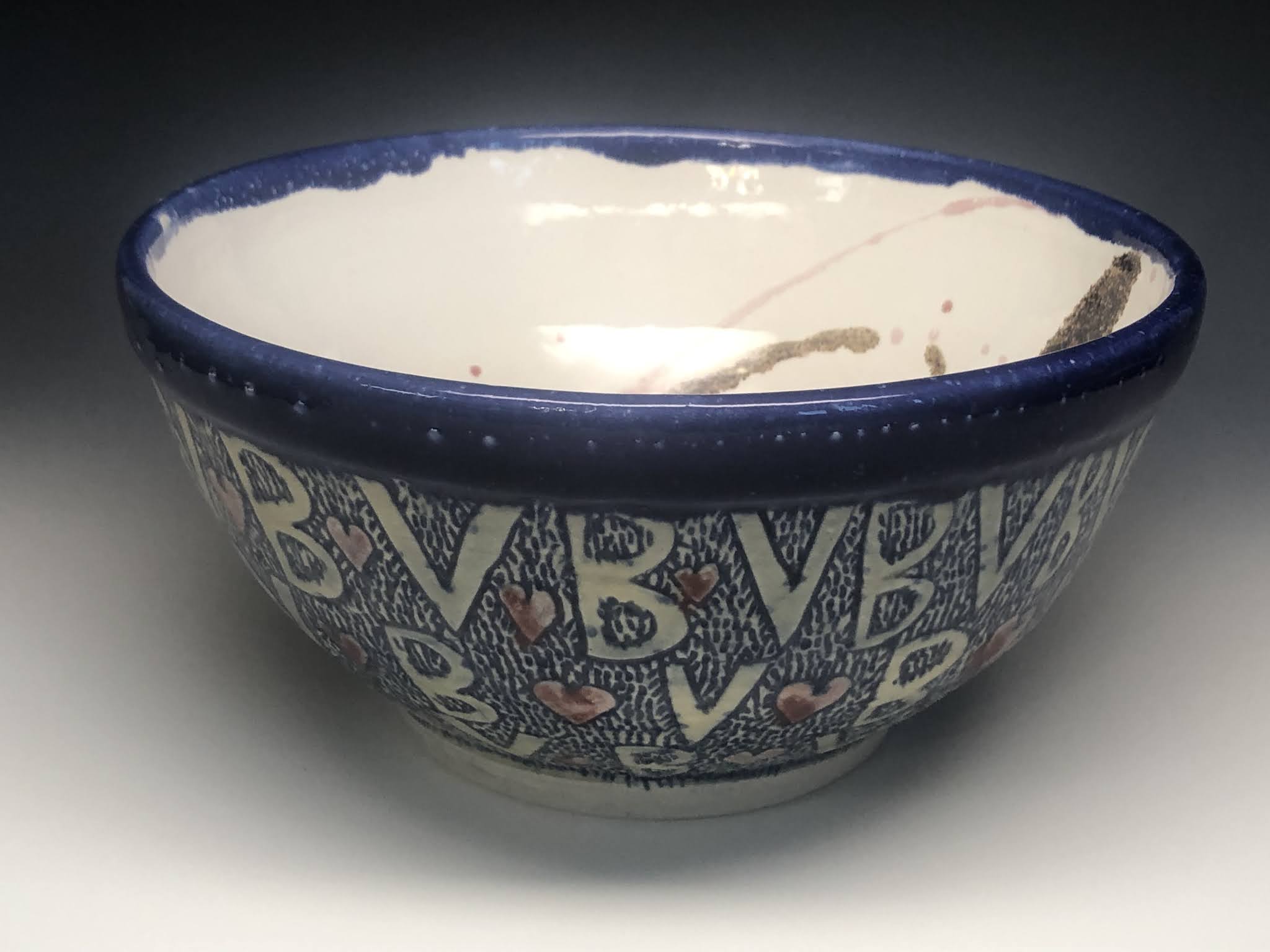
| Wide bowl with B(heart)V stamp |
I wanted to do more than just create bowls that looked nice, I wanted to personalize them, so I tried a few things. One was to create a stamp with their initials and a little heart in between. I used this stamp as decorative motif on two of the bowls, and as a stamp on the bottom of another.
 |
| bowl with B(heart)V stamp at the bottom |
I throw bowls regularly during the year, but rarely at home. I find throwing bowls to be kind of calming and pleasant, but I don't tend to spend a ton of time on decoration because I'm usually making them for demonstrations at school.
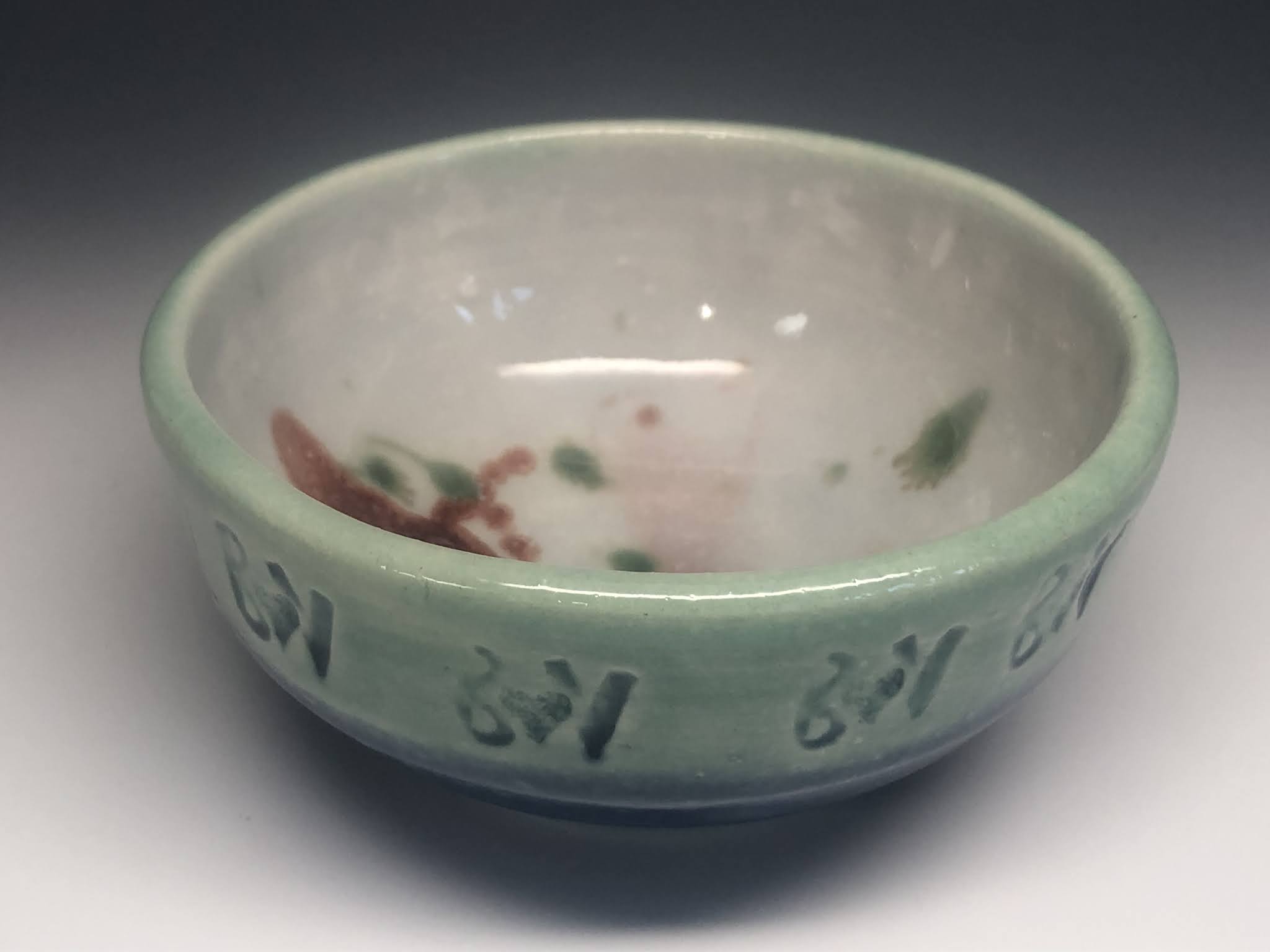 |
| Wide rim with stamp |
I wanted to try something more interesting for these bowls, so I did some of what I know and some of what I don't. I used the stamps to impress a pattern around the rim on some. On the largest, I decided to carve decorations on one of them. I spent a lot of time planning and carving and glazing the design, but I didn't do a lot of practicing beforehand. I'm basically happy with the design, even though it isn't as sophisticated as would be the carved decoration of someone who does this regularly.
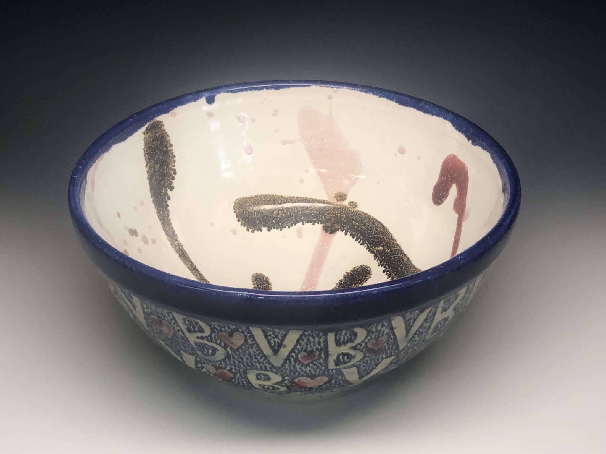 |
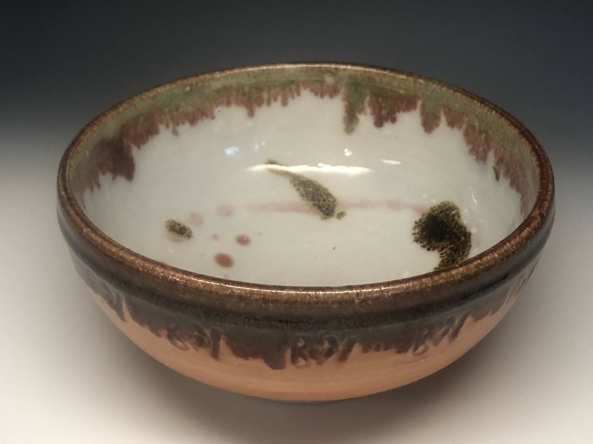
| Inside the large carved bowl |
I am pretty happy with the interiors of all the bowls. I kept these free of decoration, kept the colors of the liner glazes simple, and the dribbled other glazes over the top to add some variety and interest. The interior of the carved piece contrasts with the busy exterior.
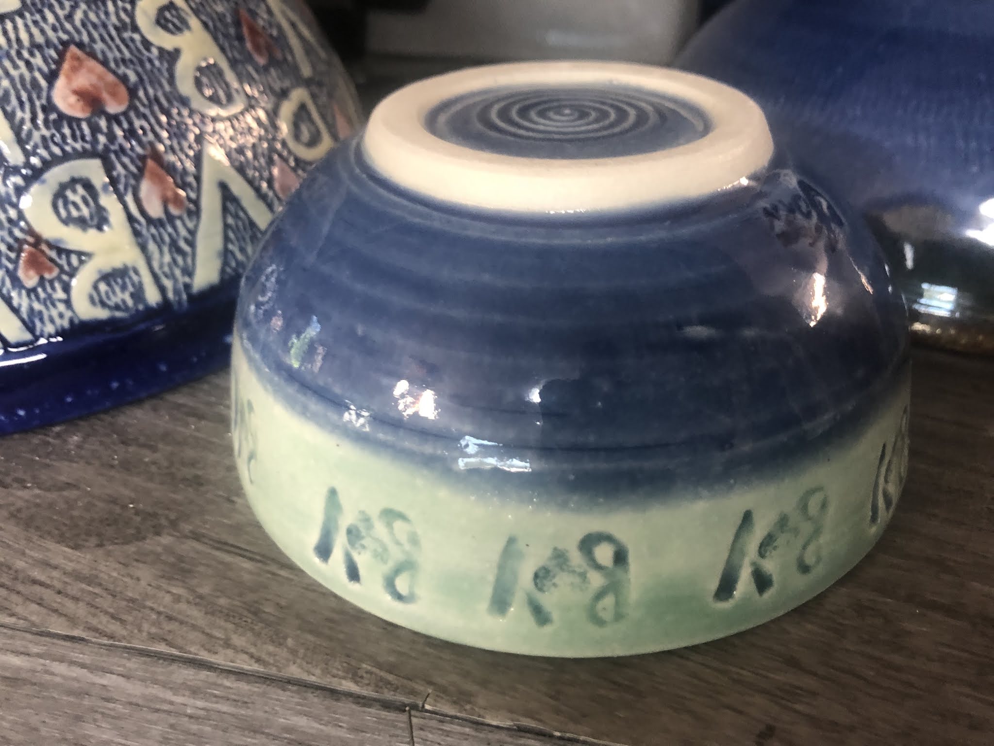 |
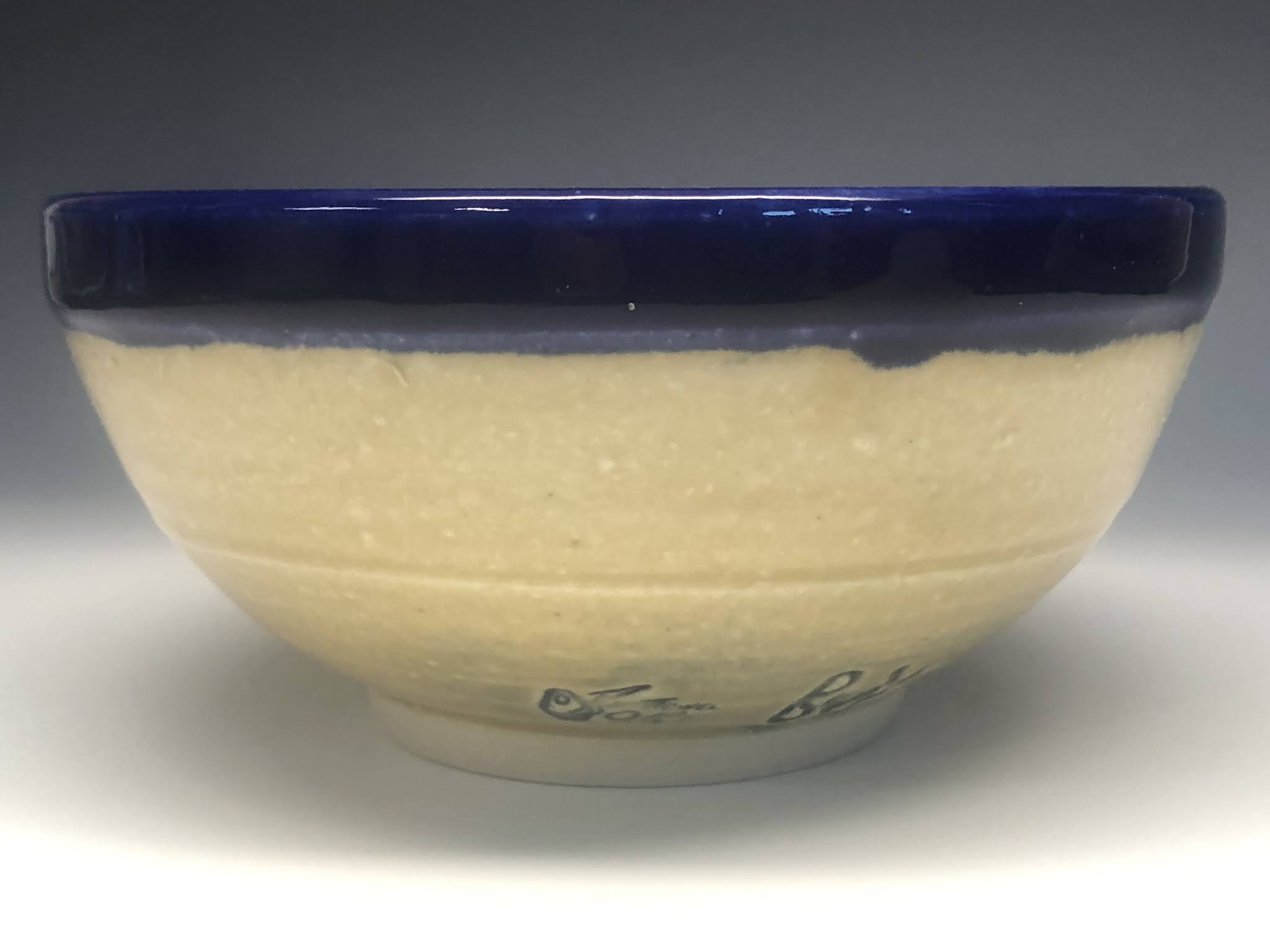
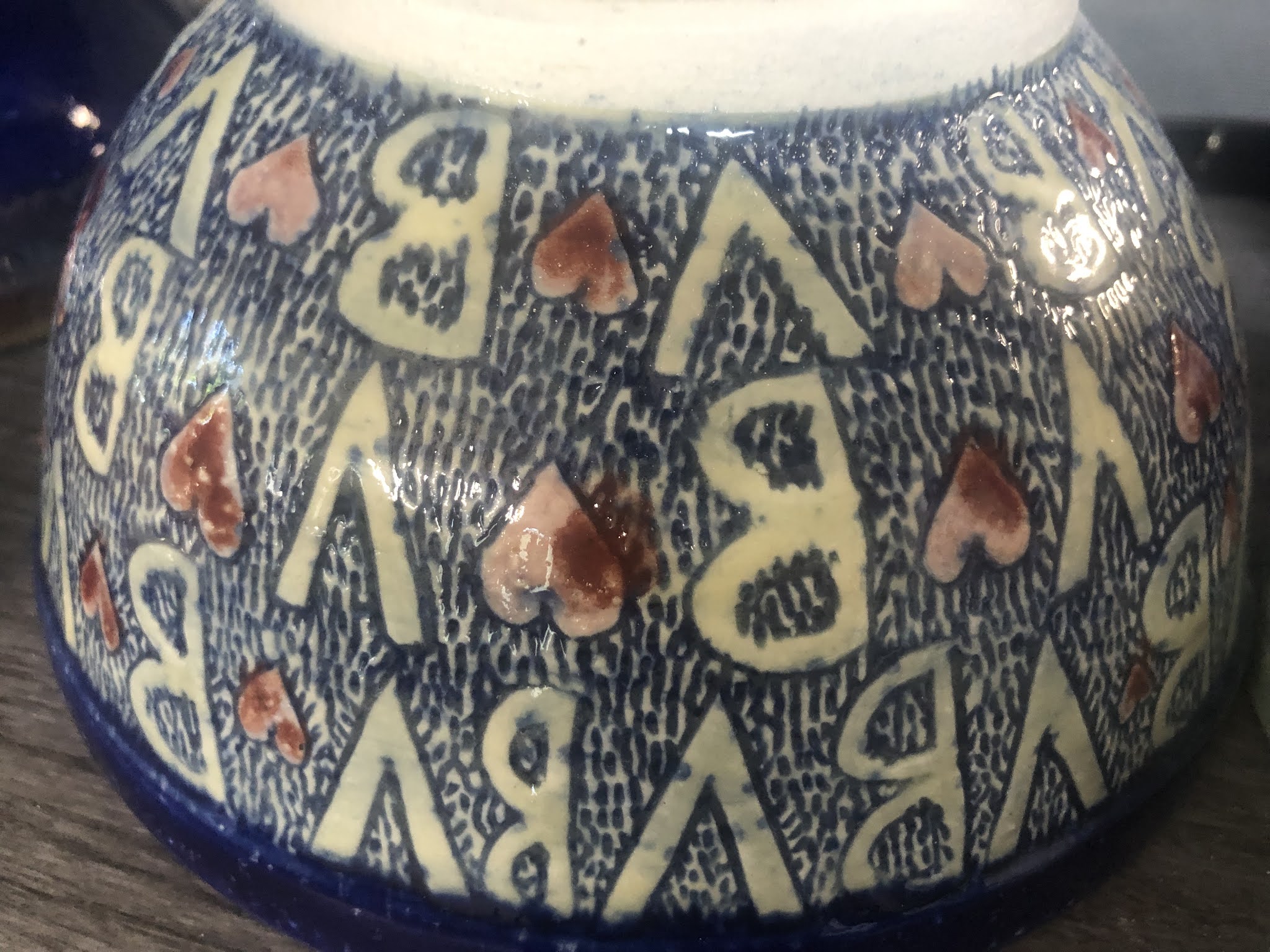
| Underside of the stampled rim bowl |
In the carved decoration, I planned for the height of each row of letters, marking a guide all the way around the bowl while it was on a banding wheel. I then staggered the letters in columns, trying to take account of the changing witdth of the bowls. (the lowest band has less space than the highest because bowls are round). After I had started carving, I decided to add the hearts, which means I didn't quite leave enough space for all of them.
 |
| I used a variety of glazes to highlight the carving on the outside |
I glazed the letters and hearts carefully, painting in a blue glaze then wiping it from the surface so it could highlight the carved background. I then glazed the hearts with a pink glaze (Amaco Celadon Cherry Blossom) waxed the hearts and applied a semitransparent glaze over the top of everything so as to highlight the letters.
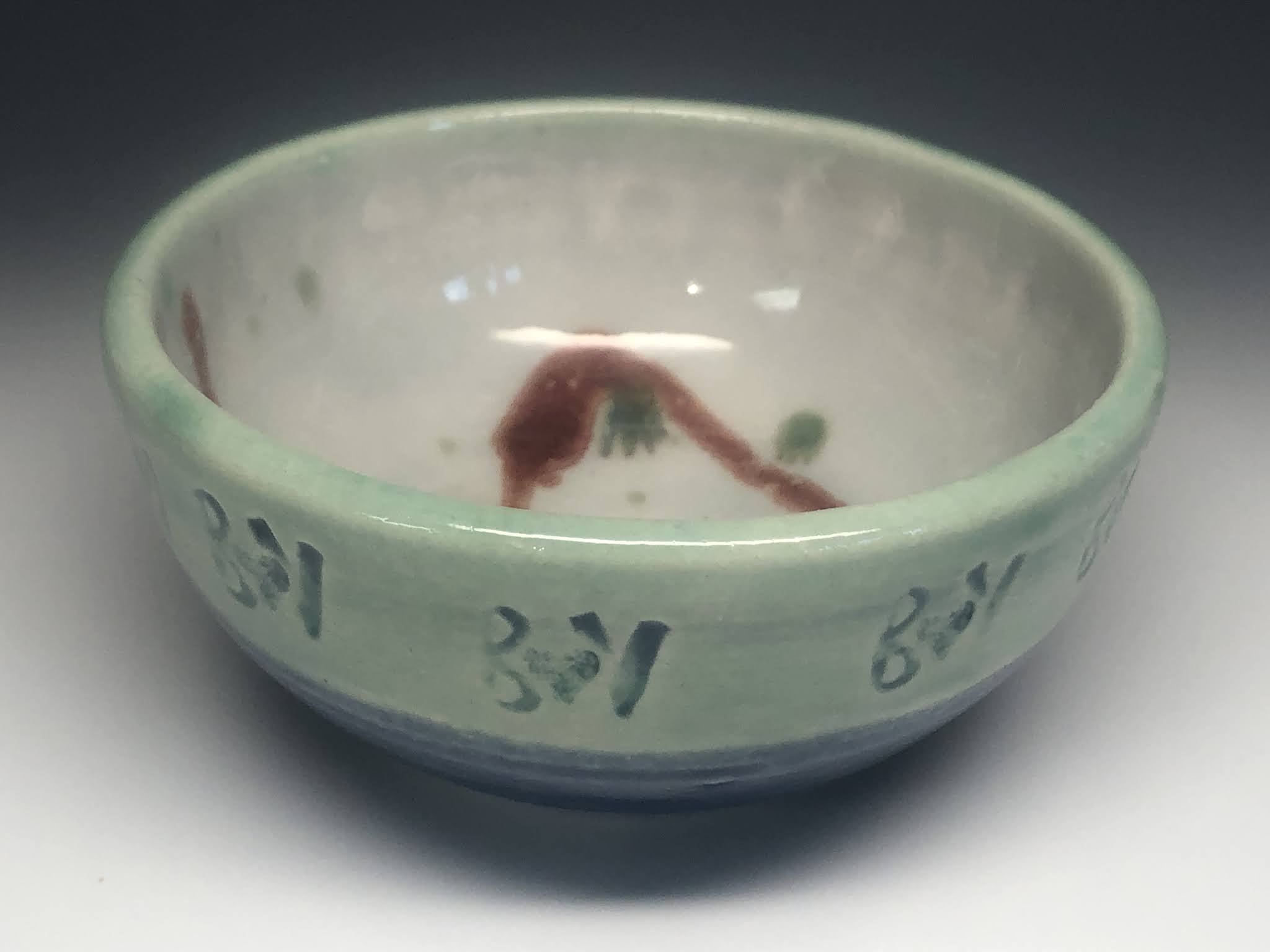 |
| I dribbled contrasting glazes inside most of the bowls |
Highlighting the indents like this is something I did in one of the stamped bowls as well. The glaze combination is the same, but the application of the light green semi-stransparent glaze may have been a bit thicker on the smaller bowl.
 |
| the red galze moved a bit during firing, which I didn't anticipate |
I realized after I had finished the pink and semi-transparent glazes that I preferred the hearts in a darker red. I applied this over the top, but unfortunately glazes move during firing. The clear and the pink both melted during the firing, as expected. This caused some of the red to move on the surface of that melting glaze, resulting in red splotches that are off set from some of the hearts. The result looks a bit like what you sometimes see in comic strips or old ads in the paper where the different colors plates weren't correctly registered so one color hasn't lined up correctly.
 |
| the same red glaze mooved on the rim which I had planned for |
Up on the rims, I was planning for some of this. I had tested some glaze combinations before this firing and liked the layering and melting effect of my red glaze (Amaco Potter's Choice name glaze) over my green (Amaco Potter's Choice Vert Luster). These colors melt and move down the side of the pot creating a nice variation and irregularity. In one of the bowls this melting somwhat obscures the impressed BV stamp.
 |
| I think the inside drizzles look great in the sun |
Some of this movement can been seen inside as well, where the dribbled glazes melt over the top of the clear and white liner glazes. The pink glaze was particularly thin in the jar, which means it was lighter where I dribbled it over the others inside.
 |
| I had fun making these and think the color combos worked out pretty well |
This batch of pieces that I sent aren't really a set. I played too much with both decoration and color for them to match, though they are all similar in texture and interior decoration. Though the process of making, glazing, firing, packing, and shipping took a couple of months, I felt a bit like I didn't have as much time as I would have liked. I would have been happy to experiment with my techinques for one whole kiln load before doing these pieces, but I never seem to find that kind of time during the school year. Here's hoping Brooke and Victor will enjoy the bowls.
Contratulations Brooke and Victor!


