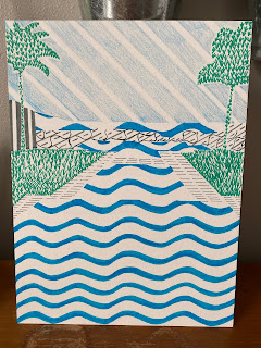
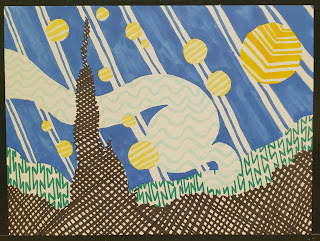
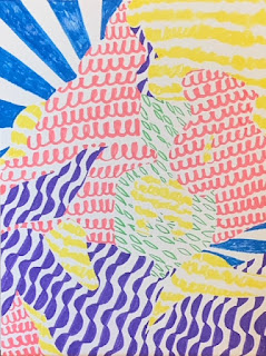
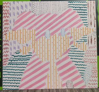
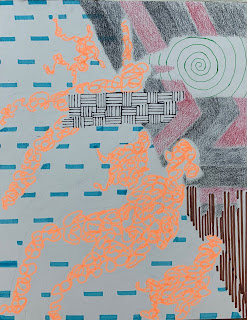
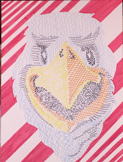
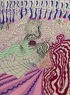
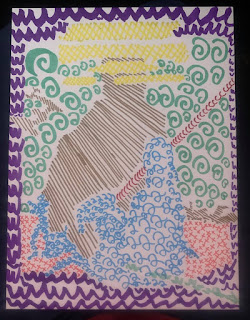
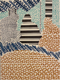
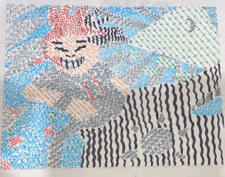
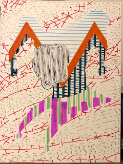
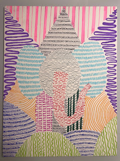
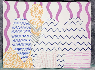
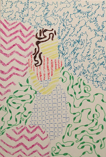
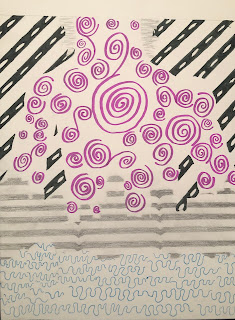
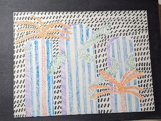
This post features work from my Design students in Fall 2020, Winter 2021, and Spring 2021. These students all gave me permission to show their work here. These represent some of the best and most interesting submissions from our Line project, the first project in all four sections of this class this past year. There were a few other submissions I would have liked to to share, had I had permission from the students.
 |
| Student Example, Winter 2021. This example has a bit of everything: carefully crafted lines (where the student probably used a ruler to keep them even), big contrasts in thickness, tone and shape of lines, consistency or repetition of line types, and a fairly complicated original to work from. |
The line project, as I said, was the first project they did in the Design class. Remember that this Design class was entirely online and was set up as an asynchronous class, meaning we didn't have shared work time or a regular meeting time as a class. Students learned the content (line qualities and line types in week 1) and the techniques from interactive lessons and demonstration videos.
 |
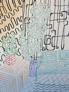
Madeline Crowder, Spring 2021. The variety in line shapes here is lots of fun, especially as the black lines in the back right seem to come from a particular era. This student has also taken advantage of line qualities that can also act as line types to define space, specifically linear perspective in the couch.
|
They created sketches, in many cases discucussed their plans with me between the sketch and the project, and then created their projects. Projects were submitted via photos into Canvas. (One added challenge this year was that students had to learn how to set up and take quality photos of their work, adjusting for lighting, location, and angle of both the work and the camera, then they needed to work out some of the challenges that came up with regards to uploads and file types).
 |
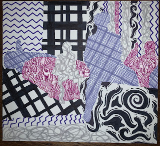
| Student Example, Winter 2021. I don't remember all of the original designs, but this one I remember because the student discussed with me how to deal with the quilt on the lap. The two figures could have been treated as one with the quilt. Not only did this student separate the figures from each other and the chair, but the quilt pieces were also separated, making for a lively composition. |
The students eventually had group critiques where they could see and discuss work created by classmates and get feedback on their own designs. All students got feedback from me, of course, on both sketches and projects, but feedback from classmates is sometimes more valuable or more interesting to students. Plus is is great for them to see each other's work.
 |
| Allison Parke, Fall 2020. Allison was in the Fall class. Fall students' works were used as examples for students in winter and spring classes. Though it may have been frustrating for fall students to do the project without many examples, they were patient with me as it was my first quarter for the online class (and this project). |
 |
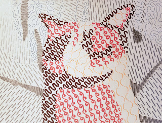
| Patrick Byers, Winter 2021. Patrick's subject is easily recognizable, but I particularly like how he has used the tonal and thickness changes in his lines to create a sense of shading in the cat. |
I hadn't taught Design on campus for years. The last time I taught Design was in the old Palmer hall, which means that I haven't taught any 2 dimensional classes in Palmer Martin Hall--ever! Palmer Hall was a round building. It was quirky and strange, as an art building should be if it can, but it didn't have hallways. The design studio functioned as the hallway between classrooms and to faculty offices, the clay studio was the hallway to the bathrooms, printshop or mailroom from faculty offices and studio classrooms.
 |
Heaven Calvert, Winter 2021. In winter, I had two sections of the design class, which allowed for many more examples in spring. It also allowed me to see a much wider range of approaches and the ways in which different sections of classes, even asynchronously, can develop a distinct character.
|
In that odd building, there was never a space for students's work to be on display. In Palmer Martin Hall, right from the start, we requested display space, both temporary and semi-permanent in the halls. What we got is excellent. We have four glass fronted locking display spaces, three for 2D and one with shelves. We also have four sculpture vitrines (pedestals with locking plexiglass boxes on top). We also have 3 walls in the downstairs hallway where student work can be hung up for critique or display. This is where the drawing, painting, design, photography, and printmaking faculty reguarly hang student work during and between classes. Usually work is up for a few week or a month. The current work has been "on display" for 15 months because we haven't been in to take it down.
 |
Lillian Davis, Winter 2021. It may not be entirely possible to distinguish Lillian's original found image, but the design is still interesting, with large and small shapes implied by the yellow and a disinct direction implied by the blue.
|
I don't use these walls myself because I haven't taught flat work in all that time, but I really enjoy seeing what students are up to. As I was uploading the images for this blog post, I realized how sad it makes me that these students' work can't be up together on display in a wall on campus.
 |
DJ, Winter 2021. In this case, the vertical and horizontal direction of most of the lines has flattened the image a bit. As with other examples, we see a consistency in the tones of lines, despite the contrast in color, shape and thickness.
|
During the year this year, I asked permission for students to let me show their work on my blog, but I was too busy and overwhelmed to actually get those posts written anywhere close to when the works were actually made. Putting the work up in the hall is a whole different game than posting the work online. Here I need to make sure I have the students' permission, check how they want their name, adjust the file name so that it doesn't contain a name I don't have permission to use, get the captions lined up correctly with the right artwork, and then write about the work (or, I guess in this case, whatever I happen to be thinking about).
 |
| Elias Reyes, Winter 2021. Students who worked with ads, book covers, or other found images with text had to decide how to treat that text. In many cases, leaving it out disrupts the original design. In this case, Elias has treated the text block in the middle as just another area to fill with his varied line qualities. |
This design project was the culmination of our line unit. I try to focus on one formal element or principle of design each week. During that week students learn about the new design concept, practice a bit in interactive lessons, and demonstrate their understand with sketches in their sketchbooks. In the line week, the sketches demonstrated concepts like implied line, expressive line, and directional line.
 |
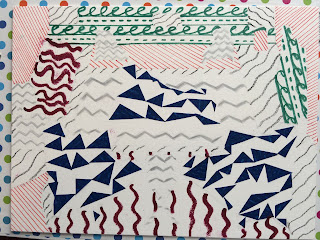
Erica Guadian-Riso, Fall 2020. Erica was one of the few students to dive into the idea that lines can be made from things that aren't pencils, pens, crayons, ro markers. The blue triangular implied lines are made of bits of tape. The different material creates a contrast in color, tone, and texture.
|
The project in week 1 focused on line qualities, specifically asking them to create a diverse array of different line qualities which might include thickness, length, color, tone, shape, and direction. Coming up with different lines seems, at first, to be an elementary exercise, but it's harder than you might think to keep varying line qualities beyond a certain point. When we try this on-campus, I have students work together to try to create varied line qualities. I walk around reminding them of ways their lines aren't yet varied. For example, they are all about the same length or thickness, they've used the same tool to create lines that are all black or grey. Eventually, I push them to make lines that aren't created with traditional drawing or writing tools. Together, as a group activity in a shared shape, this can be a fun and even a funny excercise.
 |
| Marlen Hernandez, Winter 2021. A very recognizable subject here is make recognizable not through outlines or colored in sections, but with subtle tonal and color changes and lines kept closely spaces in the subject and more widely spaced in the background. |
I tried to keep the same kind of energy in the online class, but joking and having fun are a little more contrived or awkward online and it's hard to tell if we end up at the same spot. When asking students to go back and try again in a group setting, it is easy to make it clear that the point is to push them outside their comfort zone, but asking the same thing online, asynchronously, can make it appear that they alone have made a mistake (which isn't the case).
 |
| Julia Maldonado, Winter 2021. The subject may be less clear here, but the energy in the lines and the variety in not just length and shape, but also material make this an interesting design that rewards longer looking. |
This particular project, as I said, was the culmination of week 1 and our line unit. This was a tough project in some ways, one of which was simply that they had a lot to do in the first week. The concepts weren't incredibly complex, but in that first week, they had to learn how to navigate Canvas for my class, get their materials, and learn how my class is run, all while managing their own time and working on a number of activities for the week. In an on campus class, a lot of this doesn't feel like work because it is done together as a class. We have 6 hours together in the first week, during which time we learn both concepts and the structure of the class together. Students have to get themselves to class and have homework tasks, but in an online class, students have to set aside ALL the time for class and homework, access everything themselves, and never benefit from an instructor looking over their shoulder in real time.
 |
| Kyle Win, Fall 2020. In the fall and winter I required students to meet with me to discuss their projects once every week or two. These conversations were fun for me, but they also helped the students think through design challenges like how to treat text in this first project. |
Additionally, a number of students may have been in their first online class and others who had been in online classes before might not have been in a class structured the way I structure my classes. Instructors have different ways os structuring classes in Canvas, but studios are also automatically set up a bit differently than reading/writing based classes.
 |
Student Example, Winter 2021. One of the challenges for some students wasn't so much in doing the project, but in having confidence that the project was done correctly. I asked students not to worry about creating finished projects that were recognizable, because I wanted them to start thinking about design and not subject. I suspect this was easier later in the year when there were more student examples against which to compare their own plans.
|
To prepare for their line project, students were asked to create at least 6 distinct lines that featured different line qualities. They were also asked to work from a found image (an artwork, photo, book cover, or advertising image) to create their "found" design. The idea for this project was that they would use the contrast in line qualities to imply the edges of shapes or forms in their found image. They were asked not use use outlines, shading, or fill in shapes or areas of the design.
 |
| Marvin Mendoza-Rosas, Fall 2020. It was helpful to pick an energetic design to start from, but the energy of the lines themselves matters too. Some of the most interesting designs weren't necessarily ones where the original was recognizable. |
The really successful examples, in my opinion, are the ones where the elements of the design are distinct, though not always recognizable, and the lines are striking for their contrasts. All of the examples I've shared here are good examples of both varied line qualities and those line qualities used to imply distinctions between areas in the design.
 |
| Chloe McDougal, Winter 2021. Bold contrasts in color, thickness, and tone usually resulted in a work that was striking, though creating line qualities that were similar in color, shape, or size, like those in the background, also made a difference. |
These examples come from a wide range of found images and one of the big challenges in the first week was that student had to make some decisions about where one shape, form, or "area" of a design started and another ended. Should the face be handled separately from the hair or body? Should all the areas of the wall or floor be treated as one or should they change line qualities where they are interrupted by the figures?
 |
| Student Example, Spring 2021. Even and carefully crafted lines also made for successful designs. In this example the starting image was fairly complex, meaning the student designer had to decide which parts to treat as separate and when to combine elements into one. |
Ironically, options like these are sometimes the most difficult part of a studio art class. Students who are accustomed to or comfortable with being told there is one correct answer can find it frustrating to be given options and told to choose what they think works best. This can be especially challenging when we acknowledge that some decisions "work better" than others.
 |
Student Example, Winter 2021. Students were encoruaged to make decisions about how much detail to include. For a close up, an eye might be treated as a separate element, but often entire faces or heads could be combined with the rest of the person and the whole body could be treated as one element.
For this reason, I try to give students plenty of opportunities to try different options, discuss and get feedback on their reasoning, and then discuss both their choices and choices made by peers or other artists so they can observe, describe, and consider what works well and why. |
 |
| Student Example, Winter 2021. In some cases, where there was only one figure, it made sense to separate the body into separate forms. In this example I particularly like the green line with bumps on it. |
In this line project, students were asked to sketch three different versions of the simplified composition from their original found image. The idea was that in one of these students might separate smaller details, like facial features, limbs and clothing, furniture, or walls, floor, etc, while in another they might combine areas to create whole bodies, walls, or backgrounds. They might also try different ways of identifying parts of the design. In one sketch they could separate light and dark areas. In another they might outline shapes or forms. They could try several ways of separating areas that gradually fade from light to dark. Three sketches gives them some room to try different approaches before they commit to one for the project itself.
 |
| Student Example, Winter 2021. I find it interesting how the bottom of this figure seems to melt away. In deciding how to plan their composition for this project, students sometimes had to decide how to address areas in the original that blended together seamlessly through gradations in color or tone. |
After the first class in fall, I asked students for their feedback on what worked well in class. I was happy to be able to provide winter and spring students with many more examples from classmates, as well as some comments from me on what worked well. I think those were helpful for students. In fall and especially winter I required more real-time (via Zoom) interaction with me than I did in the spring. Limiting how much they were forced to interact with me was a mistake. Students may not choose to meet with their instructor, but even a few 5 minute interactions throughout the quarter seem to make a big difference in both student's confidence and the work they create.
 |
| Student Example, Fall 2020. I really appreciate my fall students who dove into the project and accepted the parameters of the (slightly strange) assignment before there were finished examples to build on. |
It has been such fun for me to look at all the works together from three quarters and four classes. I suspect my assignment directions and feedback became clearer and more helpful as the year progressed. I also think that the kind of artificial community we were able to build within classes and between classes where students could see their classmates' work helped a lot. A tiny bit in winter and a bit more in spring, I started to build in some of this artificial community by asking students to record or recommend videos explaining things that had confused them the first time around. I hope this will help student feel like they are not just in a class with me alone.
Note: All students whose work is featured above gave permission for that work to be shown. Students listed as "Student Example" requested to remain anonymous.
