I updated my website this summer, check it out here:
www.racheldorn.com and let me know what you think!
 |
| My homepage looks pretty similar to before. I didn't update the main images. |
I
created my current website in 2013, using Squarespace. I've had a website since sometime in grad school (circa 2003-2006), back when websites required the creator to know HTML or secure the assistance of someone who did. (I had a bit of the former and a lot of the latter).
 |
| My current and upcoming exhibitions page has had a major overhaul because I couldn't get the built-in formatting to work reliably. |
Squarespace has worked pretty well for me and I haven't had to make major changes in the time between 2013 and now, which has been nice. Before then I struggled with some hosting issues and tools that I used becoming obsolete. My images and CV had been updated a bit through 2018, but the events listing had lagged a bit farther behind. Mine was far from the most out of date professional artist website I could name, but it wasn't what I wanted it to be.
 |
| The "Gallery" page now links to 4 types of galleries: sculpture, installation, works in progress, and functional. Squarespace's fomat kind of forced this arrangement on me. |
When I went in to assess what I needed to revise this summer, I realized that I didn't have any kind of social media links, the bio and artist's and teaching statements had become a bit dated, and I didn't have as many fresh and updated images as I'd like.
 |
| The "Social Media" page is brand new |
This summer I made some adjustments to the pages I have listed, pulling the CV off entirely, and adding a "Social Media" page. I set it up so that images from my Instagram constantly update. Hopefully this works for visitors to my website, although it is not updating in my browser, possibly because I need to clear my cache, possibly because I need to close some of the 87 tabs I have open right now ;-)
 |
| This Instagram feed allows visitors to scroll through recent posts (theoretically) |
I made some major changes to the tone of my contact/connect page (and renamed it). What I already have online might be the easiest way for folks to find information, so I wanted to direct them there before having them email me. I've added some sections to this connect page that direct folks to this blog (which I update more frequently than the website), Oak Hollow Gallery (where my work is on display), YVC (for people looking for classes), and my YouTube channel. I get asked a lot about clay classes, but I don't teach throwing from home, so directing them to the school is most efficient. YouTube is also a good place to go for folks trying try learn to throw from home.
 |
| Contact page with old background and missing the feedback request |
As I was drafting this post and continuing to revise the website, I realized that I actually would love to hear from folks, especially with recommendations for what I can demonstrate, show, or write about here or on YouTube. So I added a request for comments, questions, suggestions and feedback. Hopefully this might give me some good ideas for what folks like to see.
 |
| New "Connect" page with links and request for suggestions |
The other subtle aesthetic change I made to the website was to switch out the background image. The old one was a bit low quality and now what I've been making lately. It had been bothering me for a while, but I needed to spend some time to remember how to change it. I swapped it out for a newer image with higher resolution. I'm a bit concerned that the text has gotten harder to read over the top. I wonder if Squarespace has an accessible (easy to read) version for folks or if that's my responsibility.
 |
| Background image for the whole site |
The biggest (or most time consuming) change was to the text. I made some major revisions to my bio, artist statement(s) and teaching philosophy. These needed an update generally, but I also put in a lot of links. My favorite thing about the blog is getting into tons of detail on whatever thing I'm thinking about, so I just added that stuff to the statements. For every job I've every applied to, the amount of writing I have here is too much, but its my own website and I'm not applying for a job right now, so I don't mind.
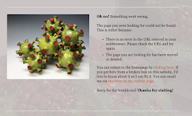
I also added a personalized 404 or "Page Not Found" page. I hope not to need it, of course, but if I missed a link when I was revising, I'm hoping folks will let me know about it. My new 404 page is nicer than the standard one anyway. I thought a picture of Covids was appropriate to suggest something that had gone wrong.
 |
| my new "not found" page asks people to let me know if I have an error |
As of this writing, I have not finished updating my website, but it's at an acceptable level of updated. I've gotten rid of most of the obvious errors or outdated information and added information about the two (as of when I'm writing) upcoming events. I still have a bit of revising to do to the multiple teaching statements at the bottom of the "About Me" page. And I still want to add to and adjust my artwork image galleries. I have some work now from the last year, but I want to add more and I'd like to update captions on quite a few images that never had them.


No comments:
Post a Comment
Tell me what you think about my work or this post